_______________________________________
Performance Heat Map
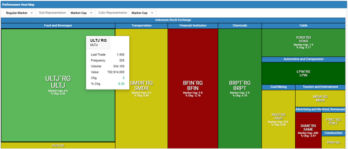
The heat map is a graphical representation of data where the individual values contained in a matrix are represented as colors.
Use the performance heat map to view important market information in different views. The significant color and size changes in the map shows symbols which are booming and declining and helps you identify the current market trend of an exchange and the performance of
symbols of the selected exchange.
You can select a base population and view the symbols based on the criteria you select for color, size representations and grouping. Each colored rectangle in the map represents an individual symbol.
Performance Heat Map - Color Representation
The color representation used in the performance heat maps can be categorized as below based on Market Cap, Volume, % Change, and Frequency.
Performance Heat Map - Size Representation
The size representation used in the performance heat maps can be categorized as below based on Market Cap, Volume, and Frequency.
STEPS
To view the Performance Heat Map:
1.On the Main Menu select  . . 2.Select the Market, Size Representation, Color Representation from the dropdown in the top panel to modify the view of the Heat Map.
|
|