_______________________________________
Chart Styles
Use this procedure to change the default plotting style for stock prices. Depending on the timeframe used for charts, the chart-style can either simplify the chart viewing, or provide additional information for making decisions about the price pattern of a stock. Furthermore, a variety of format options are available for changing chart colours and line styles.
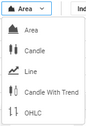
The below chart styles are available:
1.Area 2.Candle 3.OHLC 4.Line 5.Candle with Trend |
|
STEPS
To change Chart Styles:
1.On the Main Menu select  . . 2.Select the preferred chart style from the above list.
|
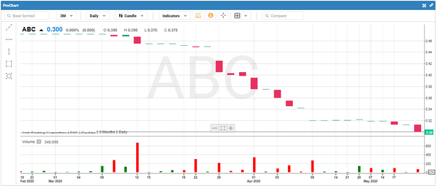
Candle
Candlestick bars also indicate the high-to-low range with a vertical line. However, in candlestick charting, the larger block in the middle indicates the range between the opening and closing prices.
Traditionally, if the block in the middle is filled or colored in, then the stock closed lower than it opened. Thus for filled blocks, the top of the block is the opening price, and the bottom of the block is the closing price. If the closing price is higher than the opening price, then the block in the middle will be white or hollow or unfilled.
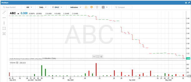
OHLC
OHLC stands for the 4 elements displayed on a typical price bar:
1.Opening Price 2.Highest Price 3.Lowest Price 4.Closing Price
This type of chart is often used to spot trends and view stock movements, particularly on a shorter term basis.
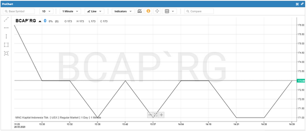
Line
A line chart is the simplest type of chart. In a line chart, a single line represents the security’s closing price on each day. Dates are displayed along the (X) axis (horizontal axis) and prices are displayed on the (Y) axis (vertical axis). It provides an uncluttered, easy
to understand view of a security’s price. Line charts are typically displayed using a security’s closing prices.
|